The Best Color Schemes for Color-Coordinated Family Photos
Learn about the best color palettes to wear for your family portrait.
What are the best color schemes for family photos? The answer depends on a number of factors, with the most important being your location and the time of year. A well-chosen color palette will complement your surroundings and help create an eye-catching image. Below, we share examples of family picture color palette ideas, organized by season. Don’t forget to discuss wardrobe options with your photographer, who can share advice tailored to your family’s needs!
Read on for tips and ideas that will help you get the best family photos possible.
Color Schemes for Fall Family Photos
There are many reasons to take family photos in the fall:
- The leaves are changing, providing scenic backdrops
- Temperatures are lower, allowing for layering.
- Your photos will be ready for the end-of-year holidays!
Let’s take a look at different color schemes for family photos in the fall.
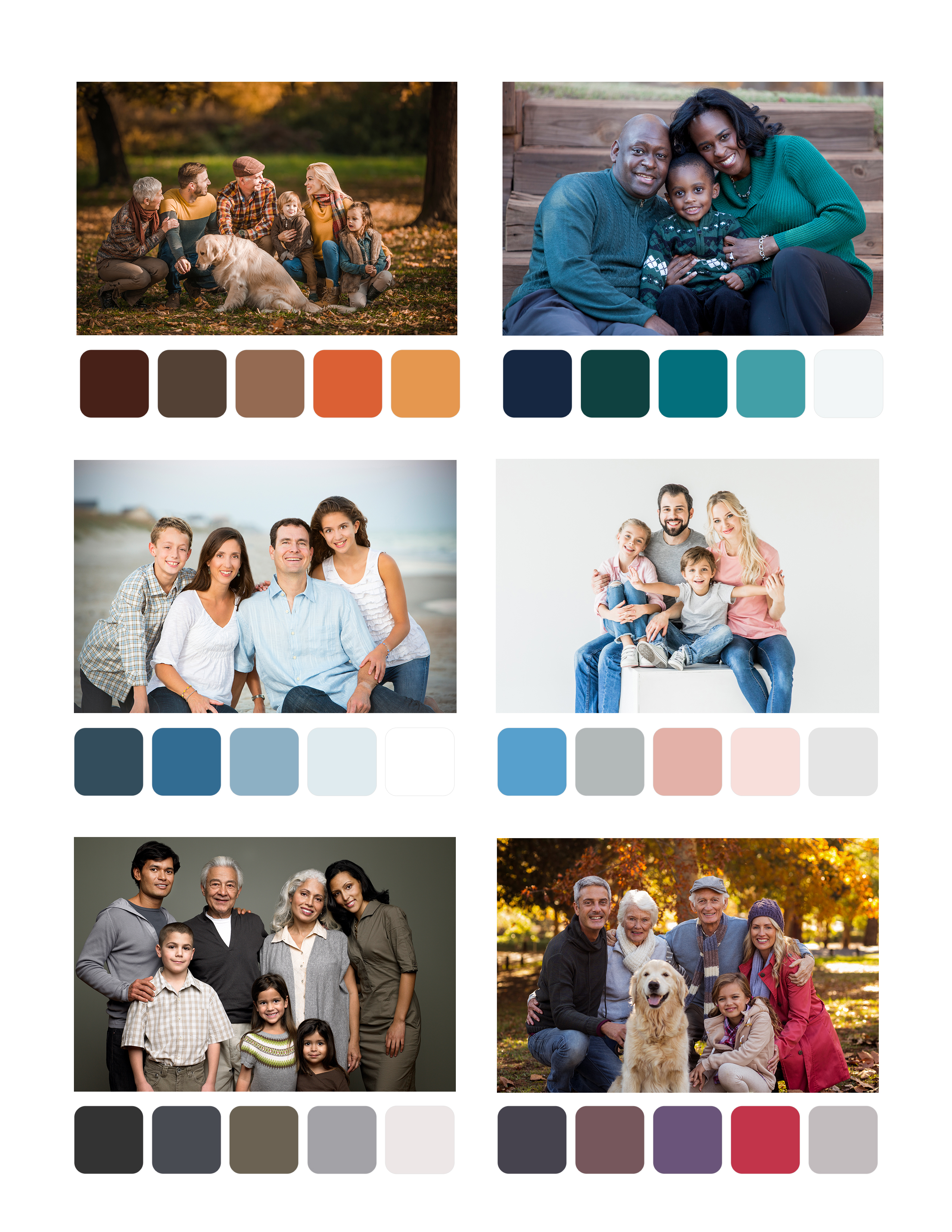
Browns, Tans, & Oranges
These are the quintessential fall colors, so they mesh beautifully with natural backgrounds. This makes them excellent color palettes for family photos taken in the fall. Choose color palettes like mustard, olive, dark orange, brown, and white. Dark red, brown, mustard, and cream is another winning combination. And don’t be afraid to add a bit of texture, like denim, knits, or corduroy.
Drabs & Purples
These colors look great against a colorful woodland background. Olive, blue, khaki, and white have a crisp, refreshing look that fits the season perfectly. And a combination of navy, cream, and tan offers strong contrast with a background of oranges, reds, or yellows. You can also add shades of aqua or yellow to spice up the mix.
Winter Family Photo Color Schemes
A winter family portrait lets you preserve your treasured holiday memories—and add a personal touch to your holiday cards! Here are a few excellent color schemes for winter.
Green & Neutrals
Deep forest or emerald green really “pops” against a snowy background or in indoor settings with neutral colors. Complement it with warm gray, cream, and black.
Red & Neutrals
Red adds a festive holiday feel to family photos. Cherry red tones will pop against the snow or a deep green forest, while shades of cranberry or wine will add elegance. Deep gray, black, and cream will tie it all together.
Light Colors
Don’t have much snow? Or, do you simply want a look that softly contrasts with your surroundings? Opt for rosy beige, cream, gray, and brown tones.
Outdoor Color Schemes for Spring & Summer Photos
During these times of year, outdoor lighting and weather can be less predictable. So, consider family picture color schemes that will look good under a range of conditions, like brighter sun or an overcast sky. Try holding your photo session during the “golden hour” in the evening or early morning.
Here are a few family photo color palette ideas for spring and summer.
Blues & Greens
Blues, greens, and neutrals have an airy, natural feel that works well whether you’re on a beach or in the countryside. Go with muted tones or choose a brighter blue or green for a bolder look. Just be careful not to choose greens that closely match the scenery.
Blues & White
These colors stand out against a green background like a park. They also keep the color combination simple and crisp. Add different blue tones for subtle variation, or marigold for a sunny accent.
Navy & Coral
Pair this color combo with white and a dusty blue gray, suggests Kristen Fotta Photography. The boldness of the coral adds a playful burst of color that looks right at home among spring wildflowers or summer gardens.
Muted Pastels
A palette of muted pastels paired with navy and mustard is full of life but not overwhelming, as colors won’t be competing with each other. Think lilac, mint green, and baby blue.
Whites & Creams
Finally, everyone could wear shades of white and cream—but with variations in texture or subtle patterns as accents. This color scheme will softly contrast with your surroundings during the golden hour.
Color Schemes for Indoor Photos
For indoor photos, you’ll probably be in a studio, which can provide the right background and lighting for any family photo color scheme. Here are some examples of color palettes to consider, but the sky's the limit!
Pinks, Grays, & Denim
This color palette has a soft and muted feel that looks great against a lighter neutral background, like a room with lots of cream or white.
Earth Tones
Earth tones are highly versatile—they look great against either a more colorful background or a contrasting earth tone. For instance, a turquoise background would complement them nicely.
Picking the Perfect Color Scheme
Choose the ideal color scheme for your family photos by considering each of these factors:
- Location: Is it indoor or outdoor, urban or rural? What season is it? Think about how the color scheme will look against the background.
- Where the photo will be hung in your home: Consider the colors and aesthetic of the room where you’ll place the family portrait.
- Skin tones: As skin tones vary, choose a color scheme that complements everyone in the photo.
Now, let’s review just a few more key points to remember.
Additional Style Tips
When planning what to wear for family portraits, you’ll need to think about other choices aside from color:
- Shoes and accessories matter—opt for classic options.
- Avoid clothing with text or logos, which looks tacky in a portrait.
- Prepare backup outfits for little kids just in case of an accident.
- Wear clothes you feel comfortable in, so you look natural and happy.
- Incorporate subtle patterns to add visual interest.
Additionally, consider opting for lots of neutral or blue for large family photo color schemes. This will create a cohesive look that never grows old.
Family Picture Color Palette Ideas from a Professional Photographer
By choosing the right color palette, you’ll end up with a family photo you treasure for years to come. When planning family photos, thorough preparation will set you up for success. A professional family photographer can share tips tailored to your family’s needs, including what colors to wear.
Ready to find a photographer? Use our photographer search tool to hire the right match for your family!
Sources
Ashlie Behm Photography, “Color Schemes for Spring Family Photos”
Contrastly, “The Pros and Cons of Indoor and Outdoor Photography”
Healthline, “How to Identify Your Skin’s Undertones”
Jennifer Bowen Photography, “What to Wear in Family Photos”
The Journey of Parenthood, “30+ Best Summer Family Photo Ideas”
Kristen Fotta Photography, “Best Colors for Family Pictures Outside”
Kristen Fotta Photography, “What to Wear for Summer Family Photos”
Organized Mom, “Color Combinations for Fall Family Pictures”
Saguaro and Spruce Photography, “Color Schemes for Family Photos”